Latest topics
» K 1200 GT FOR SALE ASKING R112 000.00 onoby STEVE 19th November 2010, 13:45
» Three week Bliss
by Corlia 19th July 2010, 09:39
» From the UK - new element found in SA
by DaveS 7th July 2010, 18:53
» Tourmaster Airflow Pants
by Heretic 7th July 2010, 08:02
» Forum lockdown
by Admin 6th July 2010, 22:17
» New website, new forum!
by Marnus 6th July 2010, 20:10
» Who Will Win The Soccer World Cup
by 1150 adventure 4th July 2010, 12:06
» New forum?
by LeRoy Olivier 2nd July 2010, 10:40
» Your favourite photos
by Gert_GS_650 1st July 2010, 06:32
» NEW Clubhouse
by Thomas 30th June 2010, 21:44
Who is online?
In total there are 14 users online :: 0 Registered, 0 Hidden and 14 Guests None
Most users ever online was 181 on 10th February 2021, 11:40
Statistics
We have 359 registered usersThe newest registered user is Kruger
Our users have posted a total of 17455 messages in 1456 subjects
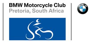
The Club Logo
+11
morpheus
szalek
Sias
tj
Happy-go-lucky
Marnus
JR
Mud Pooh-bah
Corlia
Admin
LeRoy Olivier
15 posters
Page 1 of 1

The Club Logo
![]() by LeRoy Olivier 16th March 2009, 21:22
by LeRoy Olivier 16th March 2009, 21:22
What is the general opinion of the new logo/badge - whatever you want to call it.
I have read the issues around it can understand the need for it - but - it still looks like a bowl of sphagetti to me?????
I have read the issues around it can understand the need for it - but - it still looks like a bowl of sphagetti to me?????

LeRoy Olivier- LT Fanatic
- Number of posts : 1394
Age : 62
My bike : K1200LT
Registration date : 2008-06-09
Admin- Admin
- Number of posts : 753
Registration date : 2008-02-25 -

Re: The Club Logo
![]() by Corlia 17th March 2009, 10:08
by Corlia 17th March 2009, 10:08
Okay, I'll give my 2c...
I think the logo looks great and will only take some time getting used to! (I am actually starting to like it more than the old one.. )
)
Doesn't look like a bowl of spaghetti to me... If it does look like that to you LeRoy, then you must have had a problem with the old logo as well, because in essence it is one and the same thing - only rearranged.
But, everyone is entitled to their own opinion, and this is mine..
I think the logo looks great and will only take some time getting used to! (I am actually starting to like it more than the old one..
Doesn't look like a bowl of spaghetti to me... If it does look like that to you LeRoy, then you must have had a problem with the old logo as well, because in essence it is one and the same thing - only rearranged.
But, everyone is entitled to their own opinion, and this is mine..

Corlia- Committee member

- Number of posts : 335
Age : 40
Location : Meyerspark
My bike : Dakar 650 GS Pillion
Registration date : 2008-07-15
Re: The Club Logo
![]() by Mud Pooh-bah 17th March 2009, 13:14
by Mud Pooh-bah 17th March 2009, 13:14
Leroy
Similarly to the previous logo, we repacked the logo to fit with BMW Corporate Identity requirements. It is essentially the same logo and if you do not like it, you obviously did not like the previous logo either.... In any case if you participated at the AGM you would have been able to cast your vote in that regard. The logo has been accepted by our Club members at the club's AGM via a voting process.
Not sure what all the fuss is all about regarding the change. It has been communicated several times over the past year and half at our social evenings by myself and Richard.
The logo is also been formally approved at the Clubs Africa AGM on Sunday 15 March. The format is the same for all the BMW clubs internationally. We have until 2010 to conform to BMW CI requirement or we might have had legal problems, should we want to use the BMW roundel (which is a TM) as part of our logo.
So in essence we can complain all we want regarding the format, but if we want to stay a BMW club that is the rules, and we have to stick to it.
We could always move away from BMW and become the Pretoria BeeEM MC club or something ridicilous like the Pretoria Whiners and Moaners that sometimes also ride bikes Club, but I think that will not go well with our members....................
You are also welcome to drive an initive to change the logo, within the specified CI rules, should you strongly feel that you dislike spaghetti...
Mud Pooh-bah- Turbocharged

- Number of posts : 458
Age : 114
Location : Petoorsdorp
My bike : BMW R1150 GS Adventure, Yamaha WR250F, Suzuki DR200 and counting
Registration date : 2008-06-10
Re: The Club Logo
![]() by JR 17th March 2009, 14:46
by JR 17th March 2009, 14:46
yes, let's change the name to RWLP MCC.............Riders-With-Loud-Pipes MCC 
afraid too little too late.......done and dusted......voted for and decided on...........innie bed Sarie
no complaints from this side.........I say, "flip-die-manne-en-maninne-mettie-dikbrille......... let's ride
no name or logo will prevent me from "sharing in the riding pleasure"
nou so lus ek gaan ry sommer off road

JR- The K-factor
- Number of posts : 1164
Location : Gauteng
My bike : K1300S, F800GS
Registration date : 2008-06-02
Re: The Club Logo
![]() by Marnus 17th March 2009, 15:04
by Marnus 17th March 2009, 15:04
HAHAHAHA Jamie - ek laaik jou attitude.
Actually we did not vote for or against a new logo, but rather just decided whether the new logo would be white or black spaghetti...
The rectangle, vertical bars, font and roundel were enforced by our sponsors, so as long as they sponsor, I'll be happy with their logo
At any rate it's better than being told to include Luke Watson in your rugby team

Marnus- Committee member
- Number of posts : 936
Age : 49
Location : Pretoria
My bike : R1200GSA / G450X / YZ450F
Registration date : 2008-11-20
Re: The Club Logo
![]() by JR 17th March 2009, 15:36
by JR 17th March 2009, 15:36
on a point of order.........
two votes were casted:
1. the acceptance or rejection of the proposed new logo; and
2. should it be black or white
two votes were casted:
1. the acceptance or rejection of the proposed new logo; and
2. should it be black or white
JR- The K-factor
- Number of posts : 1164
Location : Gauteng
My bike : K1300S, F800GS
Registration date : 2008-06-02
Re: The Club Logo
![]() by Marnus 17th March 2009, 15:49
by Marnus 17th March 2009, 15:49
I note your point and stand corrected. And congratulations with your 800th post on the forum!
Marnus- Committee member
- Number of posts : 936
Age : 49
Location : Pretoria
My bike : R1200GSA / G450X / YZ450F
Registration date : 2008-11-20
Re: The Club Logo
![]() by Happy-go-lucky 17th March 2009, 17:29
by Happy-go-lucky 17th March 2009, 17:29
Pieter left out one thing in his post above. If we want to change our logo, the only part we allowed to change is what appears on the blue rectangle block of the whole logo. Other than that NOTHING else.

Happy-go-lucky- Your Friendly Black Knight
- Number of posts : 378
Location : Pretoria
My bike : BMW F650GS FL 2007
Yamaha TTR250 2009
Registration date : 2008-10-06
Re: The Club Logo
![]() by tj 17th March 2009, 18:27
by tj 17th March 2009, 18:27
May I also add something...
It is difficult to accept that a sponsor to the value of R5000 per annum have so much power over our club to enforce a change of logo. If I sponsor our club with R20000 per annum (for which I will beg from the bank manager as a loan), will I also have so much power? I think not
It will rather be the BMW name and logo that we like to wave on our logo that allows us to be moved toward this change.
Personnally I am not married to the BMW name and logo in our club's identity. It is rather the 'Shared riding pleasure' that made me join the club. The fact that I ride a Beemer as most members do means little. In fact, it is not a prerequisite to own/ride a Beemer to become a member, and some bikers from outside have mentioned that they feel uncomfortable in our company! I will not shed a tear if the Club ever decides to distance itself from the BMW-logo identity
Regarding the 'spagetti'. It took me about two months to decypher our logo. It just meant nothing as I tried to read it from left to right. It was only when somebody explained it to be in Hebrew/Arabic mode that I made out the screen, rider & wheels! I like it and hope it will never change. The fact that the colour changed from black to white is very positive.
Now that I spilled my beans (spagetti) I still bow to the Club rules and decisions...

tj- Senior Contributor
- Number of posts : 674
Age : 69
Location : Bapsfontein Area
My bike : K1300GT
Registration date : 2008-06-02 -
Re: The Club Logo
![]() by Happy-go-lucky 17th March 2009, 18:57
by Happy-go-lucky 17th March 2009, 18:57
Oh, I do like the white spaghetti.
It is unusual, not the run of the mill corporate logo. It is cleverly designed, congrats to the person who did the design and to the one who came up with the idea of using curves to create a ghostly image of a bike and rider. To me, the ghostly white lines represents the spirit of riding, being wild and adventurous. As with adventure good friendships are formed along the way, which actually goes very much in line with the club's moto.
The black version, to me it got lost in the dark blue, especially once you move back away from the logo to view. The white gives good contrast against the dark blue, allowing it to be more visible at a greater distance than the black version. To me it just makes sense to have the best viewing distant range, after all we want others to be able to identify us as members of a wonderful friendly club.
Happy-go-lucky- Your Friendly Black Knight
- Number of posts : 378
Location : Pretoria
My bike : BMW F650GS FL 2007
Yamaha TTR250 2009
Registration date : 2008-10-06
Re: The Club Logo
![]() by Sias 18th March 2009, 11:44
by Sias 18th March 2009, 11:44
I think the bike and rider is like those 3D pictures you used to get in the HUISGENOOT (ja ek het al 1 of 2 keer die Huisgenoot gelees): Some people see it some people don't!
I have no problem with the new logo and understand that we had to change it. I'd prefer the old logo simply because its roundness made it look more like a badge to me... But the new logo is, although much the same, is very different and I think should be viewed on its own. Not compared with the old one!
It is in our nature to be against change, but in most cases change really is as good as a holiday!

Sias- Senior Contributor
- Number of posts : 548
Age : 41
Location : Pretoria
My bike : F650GS Dakar
Registration date : 2008-07-10
Re: The Club Logo
![]() by szalek 18th March 2009, 19:09
by szalek 18th March 2009, 19:09
Gentleman What is the Fuss??????
The badge will not change me and nor will it make me unhappy to ride under the clubs badge and banner.
Lets be proud of what we have and enjoy what we got.
shjoee that is my 2c .....piece
The badge will not change me and nor will it make me unhappy to ride under the clubs badge and banner.
Lets be proud of what we have and enjoy what we got.
shjoee that is my 2c .....piece
szalek- Supercharged

- Number of posts : 87
Age : 57
Location : Centurion
My bike : BMW K1200 RS
Registration date : 2008-07-31
Re: The Club Logo
![]() by Mud Pooh-bah 19th March 2009, 08:32
by Mud Pooh-bah 19th March 2009, 08:32
It is not only that spnsoring of the money to our club, (we can just increase the membership fees with R40 per member) but rather the affiliation to BMW clubs international that makes it advantageous to adhere to the BMW CI requirements. It gives us more bargaining power at BMW and also a chance to network with our international peers.
Should we lose the BMW identity we would be like any other MC club and I am not sure if I would still be as proud member.
The BMW identity invites a certain type of person to our club and our image, culture and Club "personality" has been carefully built around it for the past 15 years. Not sure that we can maintain this club culture, atmosphere and spirit over the long term if we lose the BMW identity.
Mud Pooh-bah- Turbocharged
- Number of posts : 458
Age : 114
Location : Petoorsdorp
My bike : BMW R1150 GS Adventure, Yamaha WR250F, Suzuki DR200 and counting
Registration date : 2008-06-10
Re: The Club Logo
![]() by JR 19th March 2009, 09:23
by JR 19th March 2009, 09:23
pdekoker wrote:......The BMW identity invites a certain type of person to our club and our image, culture and Club "personality" has been carefully built around it for the past 15 years. Not sure that we can maintain this club culture, atmosphere and spirit over the long term if we lose the BMW identity.....
I deliberately evaded touching on this aspect ..as .well lets say it might potentially be controversial but whether we agree or not, its so true.
The BMW common denominator has its own (built in) macro benefits/image/culture/philosophy/member selection criteria etc, etc ..choose one, a combination or all.
AND THIS HAS NOTHING TO DO WITH A SNOBBISH OUTLOOK!
Im not saying we are all prime citizens here heck, I mean just look at me for an (bad) example
Try to book a venue for ABC Motorcycle Club and there is automatic resistance from a fair few facility owners ..tell them its the BMW club and their attitudes are noticeably different. Why?.......it might be a perception thing but its very real the BMW identity is projecting a certain image and although this image brings some responsibilities, I believe its beneficial to us as a group..........................
sê/vra maar net??????
JR- The K-factor
- Number of posts : 1164
Location : Gauteng
My bike : K1300S, F800GS
Registration date : 2008-06-02
Re: The Club Logo
![]() by morpheus 19th March 2009, 10:11
by morpheus 19th March 2009, 10:11
I am a paid up member of the club. However, I will never place stickers or badges on my bike or person to articulate that affiliation. My reasons are many, varied and deeply personal.
The club is simply a place where like minded people gather to pursue a shared passion. This would be the case regardless of name or brand. When I purchase my KTM one day, I would still want to ride with the group, not because it is the BMW club but simply because I have made some friends.
This whole 'club vs country' is quite pointless, if you paid your money to be a member you have to comply with the rules\logos. If you don't like the rules\logos, don't pay next year! There are literally thousands of like minded riders in this beautiful country so pays your monies and takes your choice!
My 10c
Morpheus

morpheus- Turbocharged
- Number of posts : 117
Location : Centurion
My bike : 1200GS
Registration date : 2008-08-04
Re: The Club Logo
![]() by dakardrix 19th March 2009, 12:00
by dakardrix 19th March 2009, 12:00
I am not too perturbed - you would never have caught me being associated with a BMW image before. Dunno why, probably just that 'typical BMW driver' is not stated in a positive way.
But funny enough, the only reason I bought a Dakar and became a BMW motorcycle convert was that it was the only bike in its class with ABS - that simple. Only after I bought it I started reading that people actually debate the merit of ABS on tar? I get the off-road debate though.
Anyway, I don't mind what the logo looks like - although I do find the BMW badge a bit strange there on the side. But really doesn't matter. If people don't like it, let's design our BM logo, something like this...

But funny enough, the only reason I bought a Dakar and became a BMW motorcycle convert was that it was the only bike in its class with ABS - that simple. Only after I bought it I started reading that people actually debate the merit of ABS on tar?
Anyway, I don't mind what the logo looks like - although I do find the BMW badge a bit strange there on the side. But really doesn't matter. If people don't like it, let's design our BM logo, something like this...

dakardrix- Senior Contributor
- Number of posts : 608
Age : 59
Location : Pretoria
My bike : F800GS
Registration date : 2008-12-11
Re: The Club Logo
![]() by Renier 25th March 2009, 11:39
by Renier 25th March 2009, 11:39
Unless I am missing something, the same vigorous debate that was followed when the previous logo was designed and adopted was not folowed here. If this logo was the only one imposed by BMW then the message should go back to them that it lacks imagination because there is very little that one can do with a borderless rectangular block when heraldary and the production of regalia is concerned. No identity is inspired with the present form.
If BMW wants to promote the BMW brand that is fine but let us just stick to the BMW "spinning propeller".
If BMW wants to promote the BMW brand that is fine but let us just stick to the BMW "spinning propeller".
Renier- Fuel Injected

- Number of posts : 28
Age : 68
Location : Centurion
Registration date : 2008-06-13
Re: The Club Logo
![]() by steyngert 25th March 2009, 12:03
by steyngert 25th March 2009, 12:03
Wow. I just read this thread for the first time - I cannot believe the level of seriousness at which the logo is approached. This is my 2c worth:
I ride BMW because I love the quality and the lifestyle it offers me. This approach puts me into contact with people that share the same values as I do, that embraces everything that BMW stands for. I enjoy spending time with these people at club meets, at the Challenge and just greeting a fellow BMW rider on the road.
I do not give a flying vark about the logo. The logo itself means nothing on its own. It will be given meaning by the way that we conduct ourselves as responsible riders, as courteous users of highways, byways and gravel. If Richard or Jamie or Colin stops somewhere to help another person (even in a car) and wears the logo - the next time that person sees the logo anywhere, the person will be reminded of how he/she was assisted and will view whoever wears the logo with the same respect. That is how a logo starts becoming a brand.
Many years ago, the rector of University of Pretoria, professor Perreira, was asked by a student why he still drives a Volkswagen Beetle. The student commented and said that the Beetle does not live up to the status that the professor has achieved. Prof Perreira replied and said that the beetle does not add or detract from his status, instead, he adds or subtracts status to the beetle.

steyngert- Turbocharged
- Number of posts : 234
Age : 48
Location : Moreletapark
My bike : R1200 GS Adventure
Registration date : 2008-06-11
Re: The Club Logo
![]() by Richard H 25th March 2009, 22:37
by Richard H 25th March 2009, 22:37
Research has shown that automotive brands are the most recognised.
For a bit of perspective on how others handle their clubs logos, Google search the Porsche clubs, the Audi clubs, the Alfa Romeo Clubs etc.
One element remains common through them all - protection of the brand identity and the context wherein that branding may be used.
For those of you who didn't know (and those who have forgotten already although the man only died a year and a month ago) the late Honourary Member Brian Cannoo designed the logo after extensive consultation processes with members involving 14 different designs.
At that time, BMW had started strengthening their branding process and use of the roundel ('spinning propeller') within the border of the club badges was prohibited.
A number of shapes were permitted (I recall 5) which DID promote diversity, I agree.
So the previous exercise was the process of DEVELOPING a brand in order to get away from the roundel.
As members, we accepted Brian's design of a stylised motorcyclist on an RT - reminiscent of the Motoman on some BMW gear - after much discussion and debate.
This year's process was merely ADAPTING the club logo design from a semi-circle blue background into a rectangular blue background and the stylised rider from a black figure into a white figure that improves contrast within the new BMW Corporate Identity context. The whole process was consulted world-wide with the umbrella bodies over two years. BMW Clubs Africa, the umbrella where under our club resides gave extensive inputs including the lack of diversity and the problems associated with printing, embroidery etc.
The negotiations are concluded. The deal is done. The ink on the contract is dried.
Now, can we focus on what makes this club a Club - the 'Shared Riding Pleasure' and the camaraderie of riding excellent motorcycles?

Richard H- Senior Contributor
- Number of posts : 625
Age : 69
Location : Jacaranda City
My bike : R1200GS, R100S
Registration date : 2008-06-09
Re: The Club Logo
![]() by LeRoy Olivier 25th March 2009, 22:55
by LeRoy Olivier 25th March 2009, 22:55
Different people different idees - got what i was aiming for - comments on the spaghetti - tend to agree with Renier - not much could be done with the little we had to do something with.
As Richard said - the contract has been signed and the ink has dried. So lets enjoy the new logo

As Richard said - the contract has been signed and the ink has dried. So lets enjoy the new logo
LeRoy Olivier- LT Fanatic
- Number of posts : 1394
Age : 62
My bike : K1200LT
Registration date : 2008-06-09
Page 1 of 1
Permissions in this forum:
You cannot reply to topics in this forum|
|
|